Brand
Logo and assets
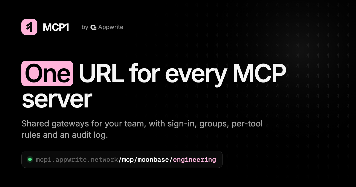
The MCP1 logo, mark, colours and product screenshots, ready for articles, integrations and slides. Use them as they are, with the few rules below.

Mark
The mark on its own
A “1” drawn from merging strokes: many servers becoming one URL. Use it where the name already appears or space is tight.


Product
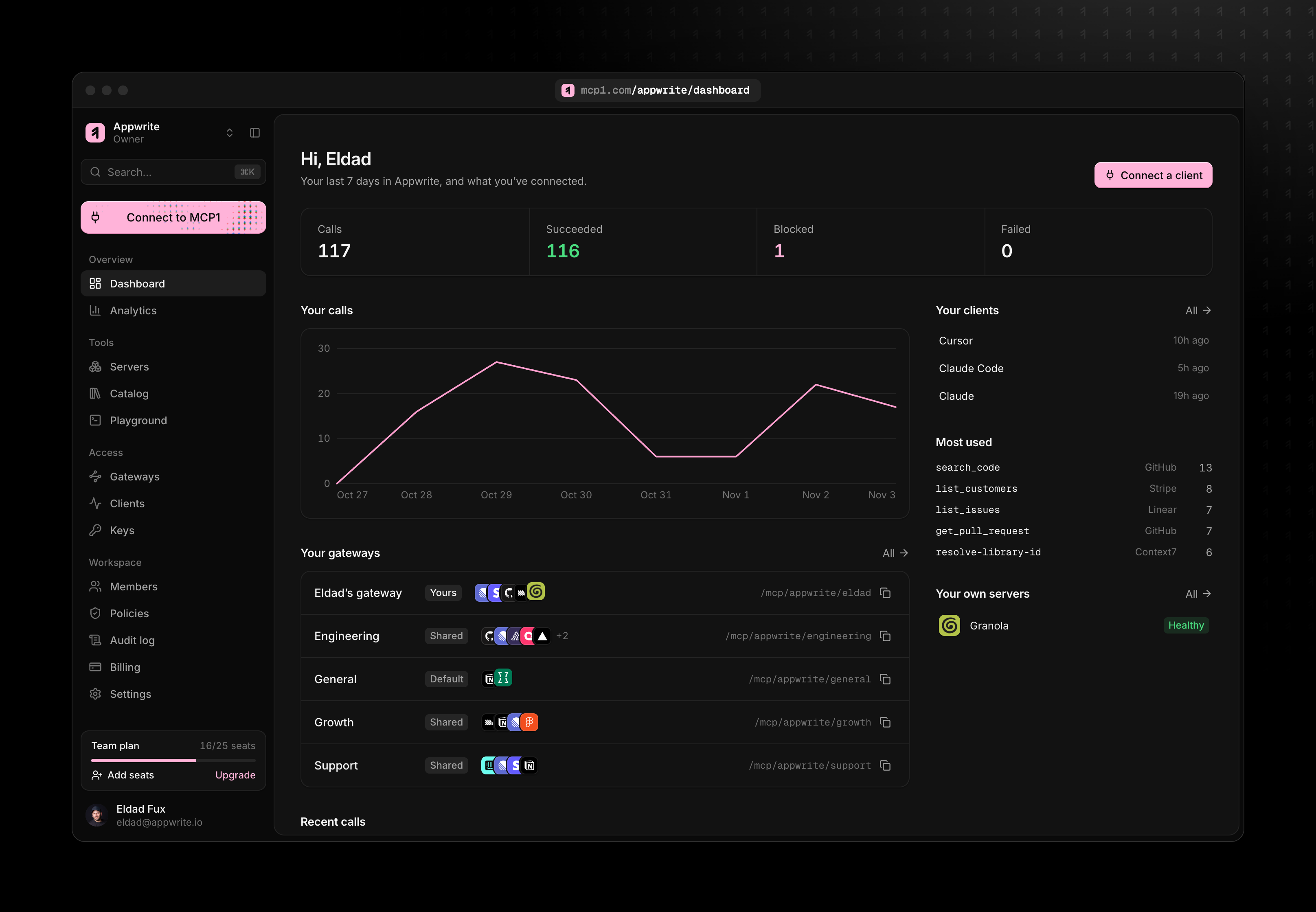
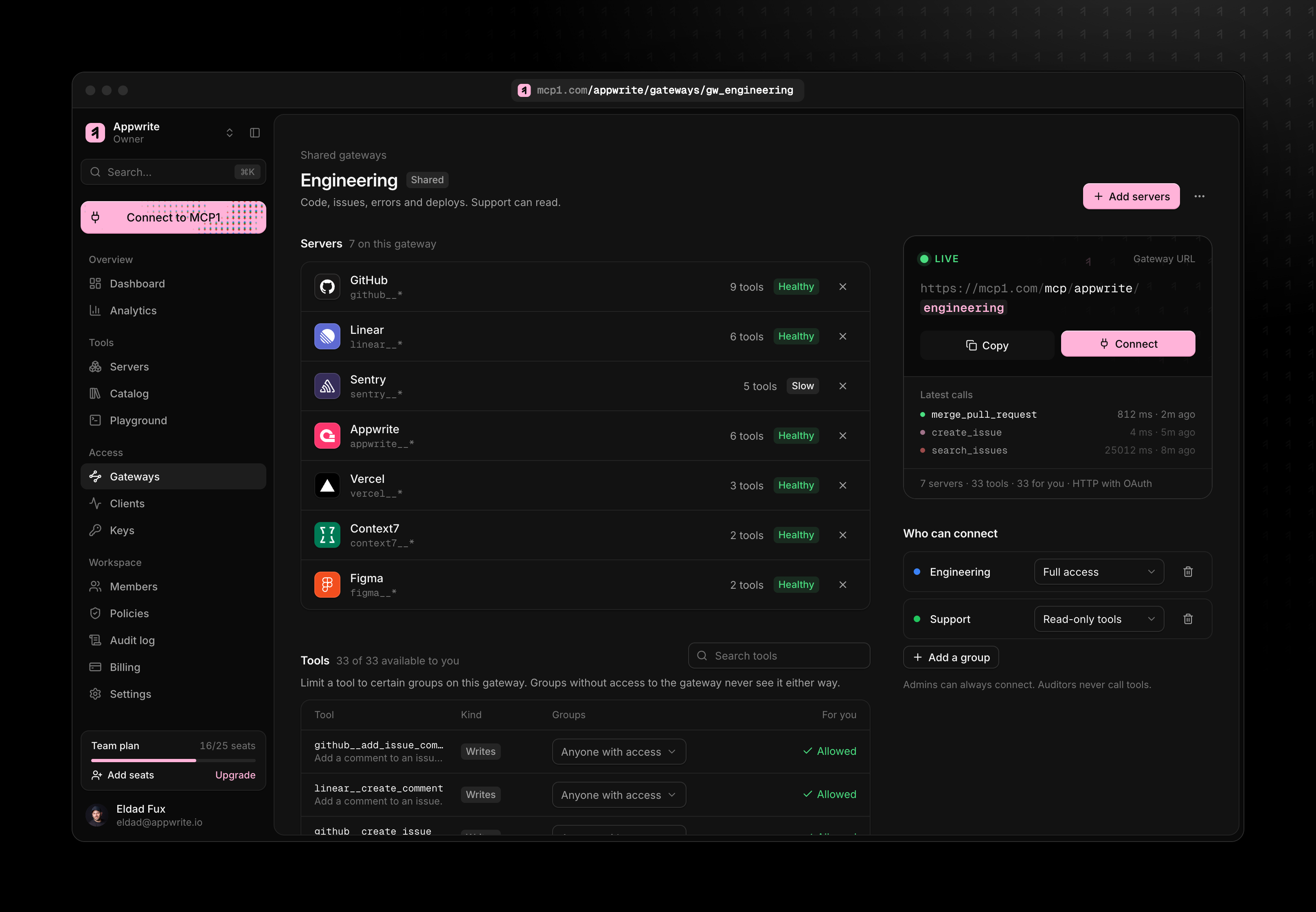
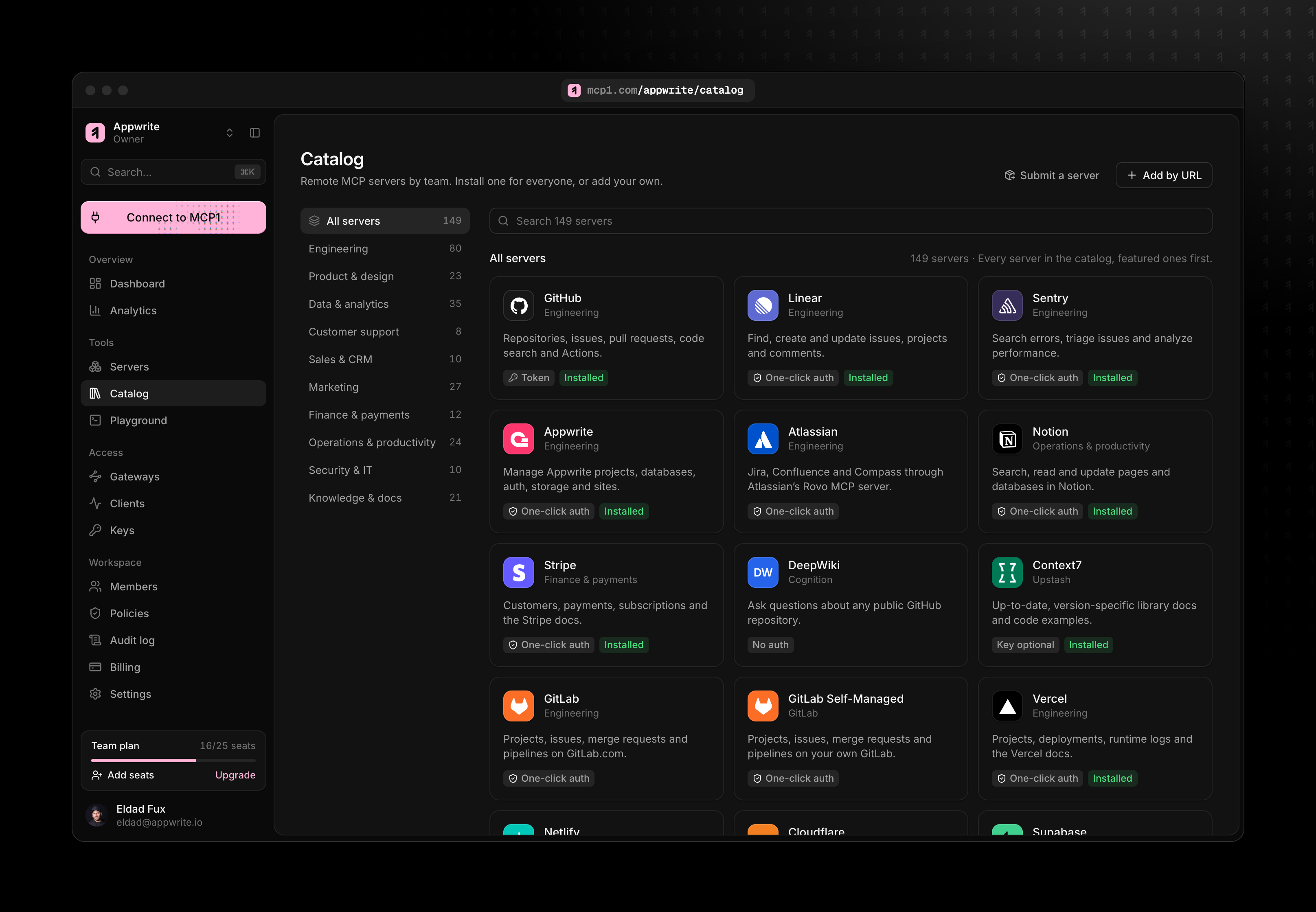
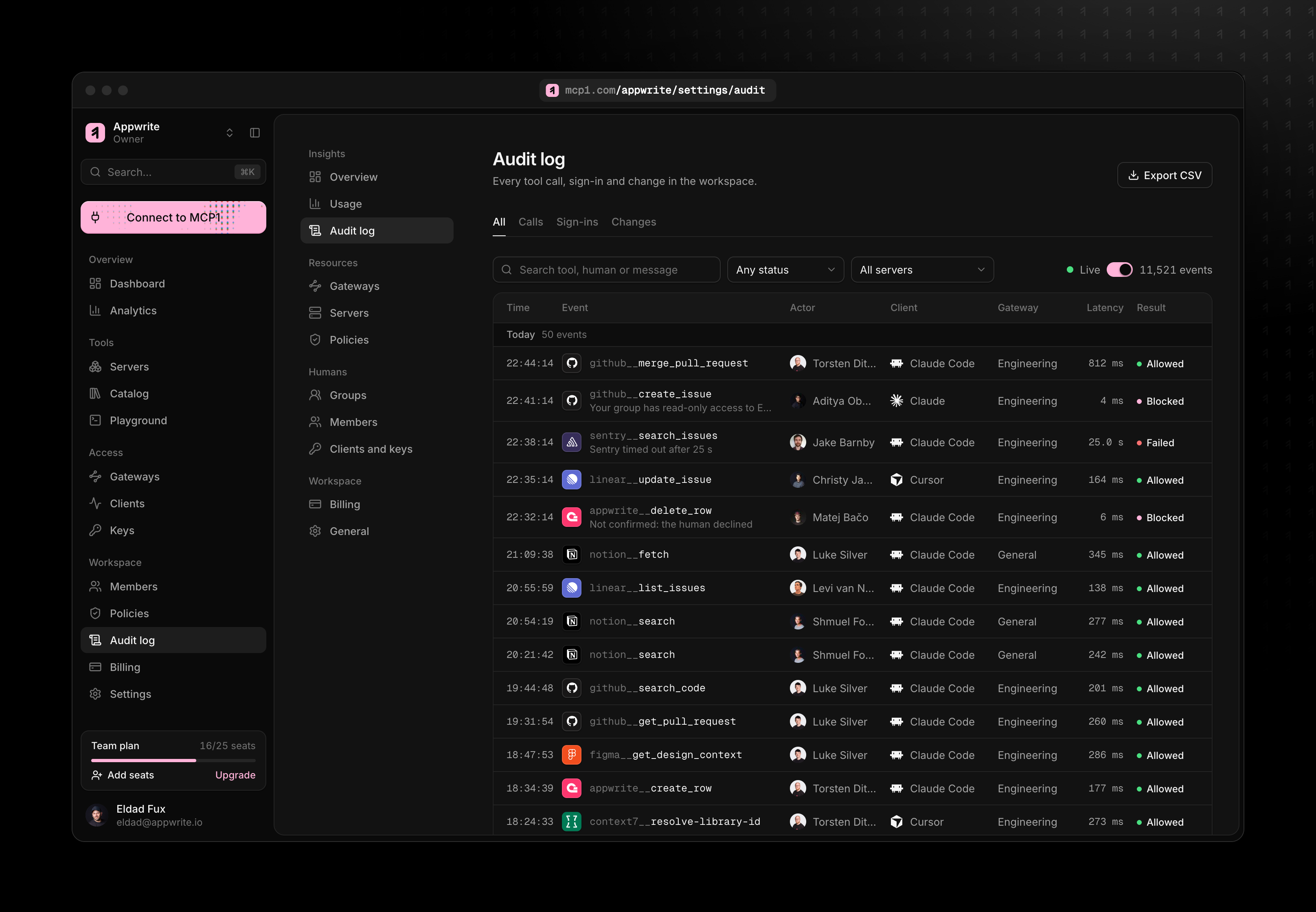
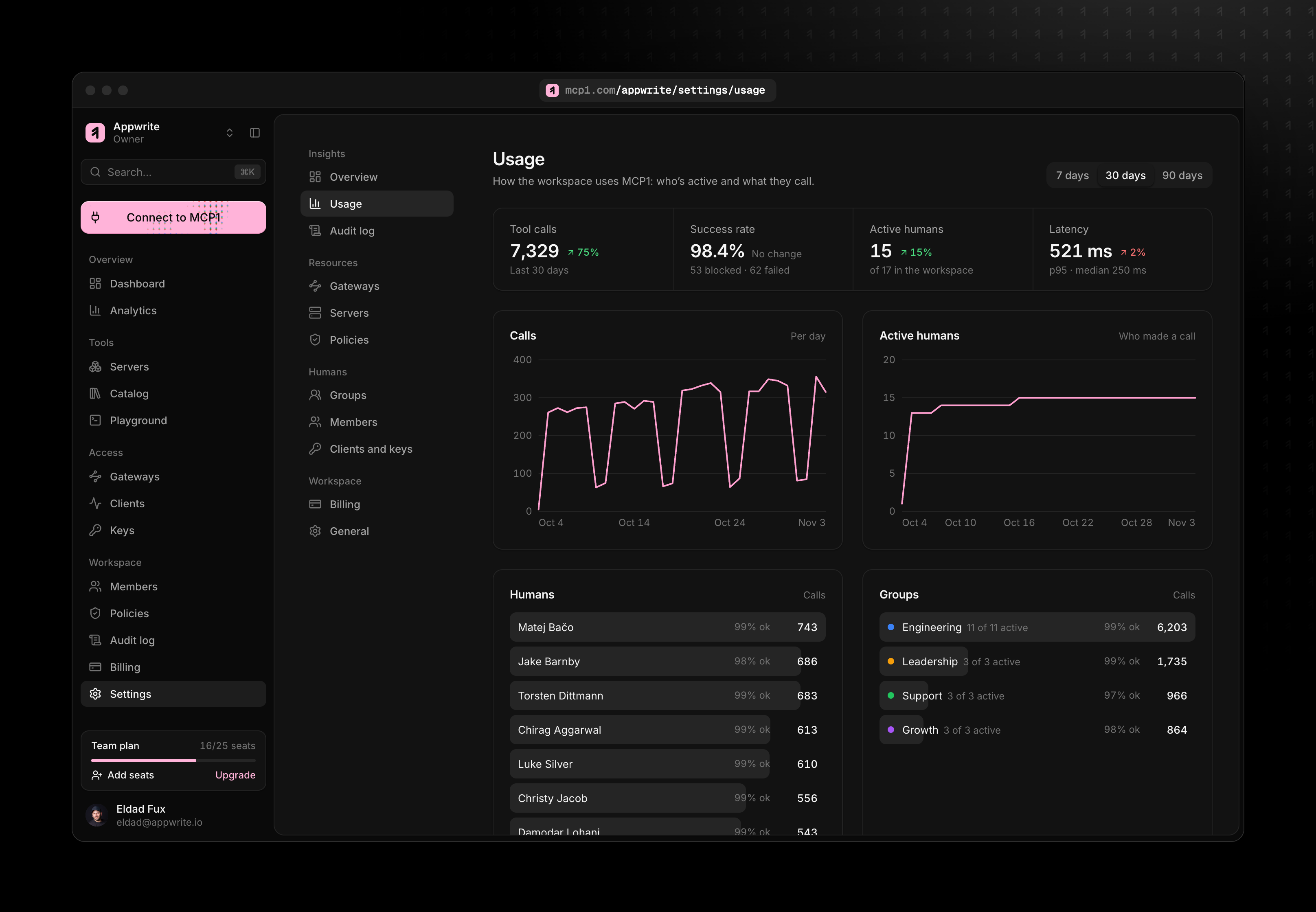
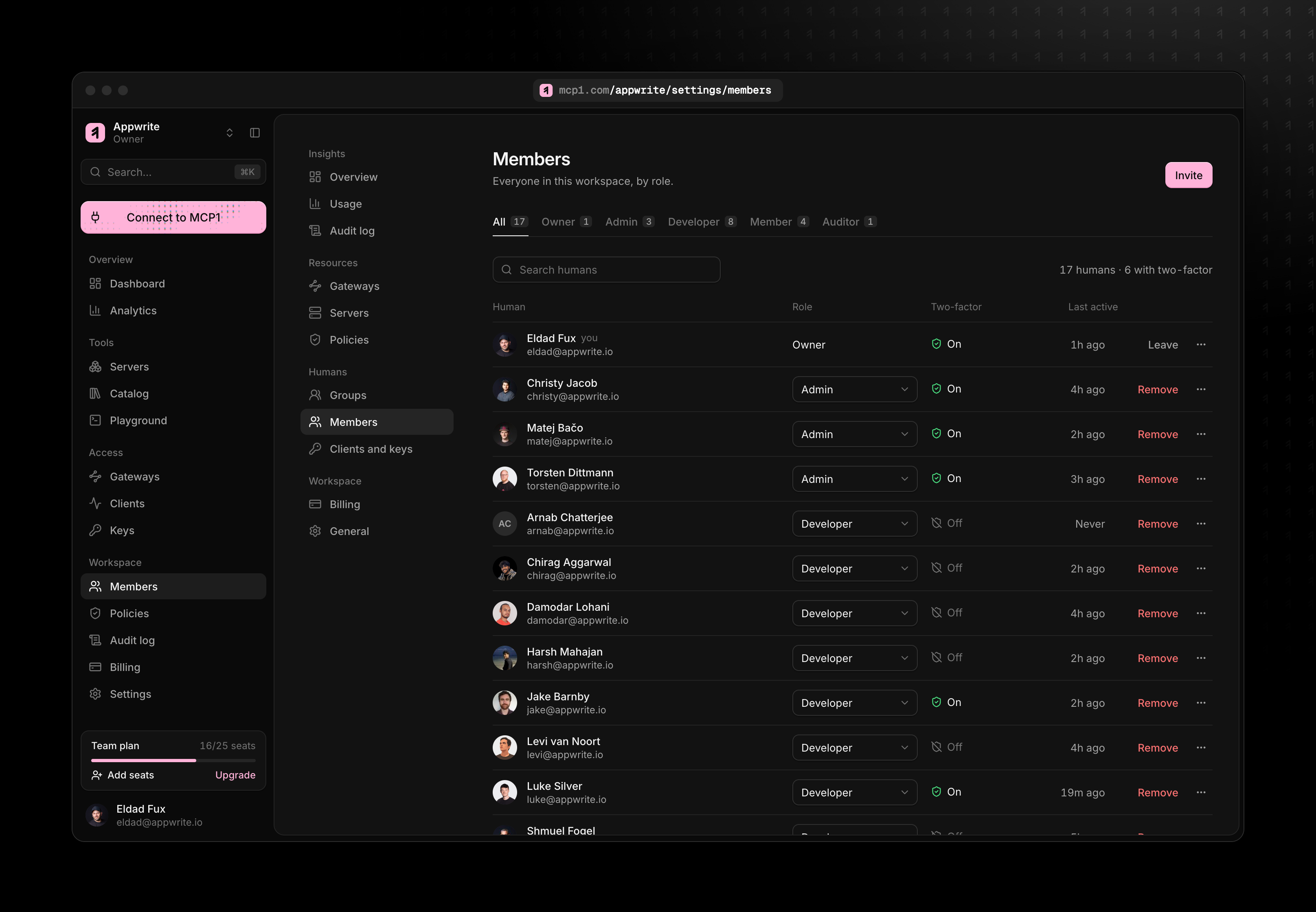
Screenshots
The app as a team uses it, framed and ready for articles and slides. Each download is 3232 × 2240.
Colour
Black, white and one pink
Pink is always solid: on the mark, a button or a line, never thinned out over a dark background. Click a colour to copy it.
Type
Two typefaces
Interface and headings
Inter
One URL for every MCP server. Semibold for headings, tight tracking; regular for text.
Inter on Google FontsURLs, tool names and code
Geist Mono
/mcp/moonbase/engineering
github__create_issue
Usage
Keep it looking like itself
Do
- Give the mark clear space of at least half its width on every side.
- Keep it at 16 px or larger on screen.
- Use the pink tile on dark, and the black tile where pink would clash.
- Write the name as MCP1, in capitals, as one word. In full: MCP1 by Appwrite.
Don’t
- Recolour the mark, or use pink at low opacity or as a glow.
- Stretch, rotate, outline or add shadows to it.
- Rebuild the wordmark in another typeface.
- Place it on busy photos without a solid backing.
Social
Social card
The image links to MCP1 show when shared. Use it for posts and announcements.
Need something else, or writing about MCP1? Get in touch.